Finding The Ford


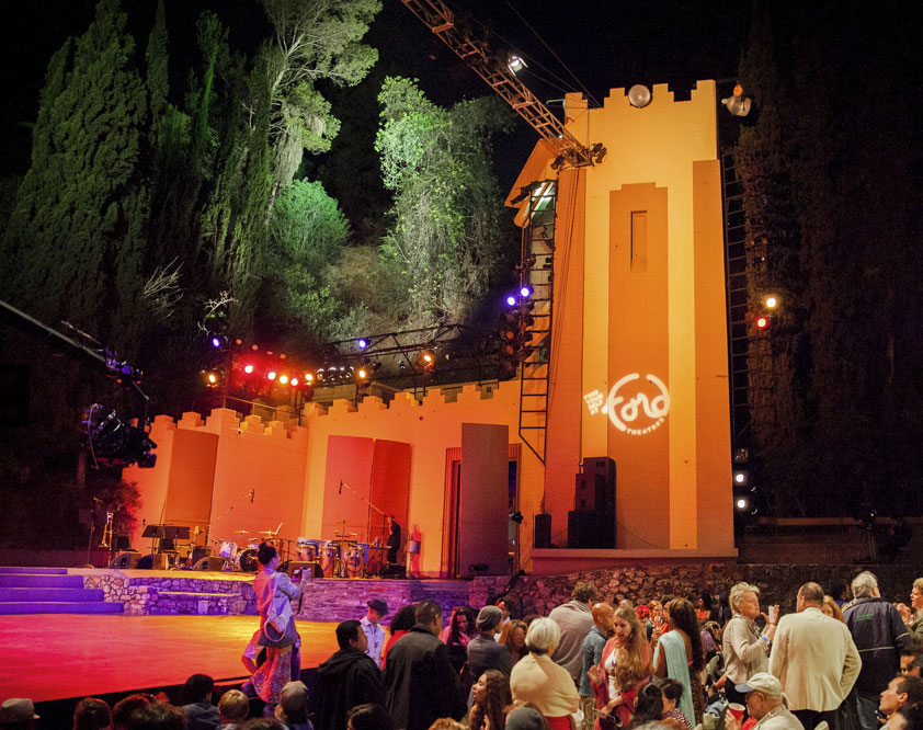
Ford Theatres, aka the John Anson Ford Theatre or Ford Amphitheater, is an intimate, open-air performance space nestled into the Hollywood Hills. This hidden gem of a venue with its eclectic programming and expansive community outreach brings the arts to those who want to be close enough to touch it.
When I met the LA County Arts Commission, who operates the venue, I was struck by how much was working in their favor: great location, beautiful surroundings, strong mission, brilliant lineup of artists from every corner of LA’s cultural landscape, and the most impressive string of Yelp reviews I’ve ever read. And yet… if I mentioned the Ford to other Angelenos I’d be greeted with a blank stare. Perhaps it was the plethora of outdoor entertainment happening in LA, particularly at the neighboring Hollywood Bowl that was keeping them a secret? More likely it was their lack of identity. We were determined to bring Ford Theatres out of the shadows.
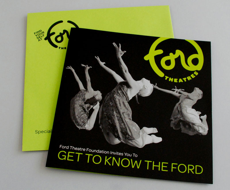
The audience familiar with the Ford love it, and aren’t shy about it. In fact, the audience had already successfully created a brand for the venue through surprisingly consistent language. We needed to create a visual world to go with it. We started with the logo – a self-contained, totally organic, hand drawn logotype designed to encapsulate the descriptives we heard over and over again: Laid Back, Friendly, Fun, Playful, Romantic, Cozy, and Welcoming. Couple the logo with a color palette sampled from the surrounding landscape and things started to take shape.
The Campaign
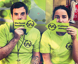
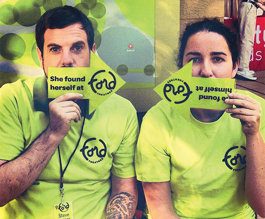
The Communications team had already been batting around a few campaign ideas for their summer series when we met. “Find Yourself at the Ford” was buried at the end of the list. It jumped out to me as an empowering call to action – not only to get butts in seats, but to find people like you on stage and in the seats around you. It was the perfect way to sum up the Ford’s mission to reflect the diverse cultures of LA County. And, it was memorable!
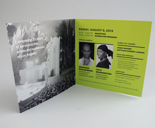
With a new look, clear message, and a small stockpile of carefully selected audience and performance images; we were poised for implementation. We designed a system of icons to reflect the look of the logo and a variety of foundation materials including a pocket calendar, postcards, web ads, digital billboards, invites, programs and more that would act as a launching point for their new visual dialogue. All materials were tied together with consistent placement of the new logo, all new typography guidelines, and a bold color palette that used the new Ford green as its base. So far the identity is hit! Staff, artists and audiences are enthusiastically embracing it and we’re excited to see how it continues to evolve.